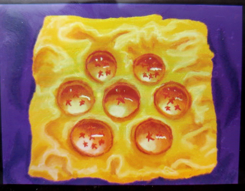
That sneak peek in my last Art Academy: Lessons for Everyone! review really didn’t give you much to go off of in what I was drawing. But it’s finished now! So read more to see the final result and I’ll go over how I put this thing together!

It probably comes as no surprise to close friends and family that my subject was Dragonball Z related. There are a few special reasons why I chose to paint the Dragonballs on my coffee table:
- The light hitting the balls reflect almost within the ball, which poses a challenge
- Challenges are good
- Dragonball Z is awesome
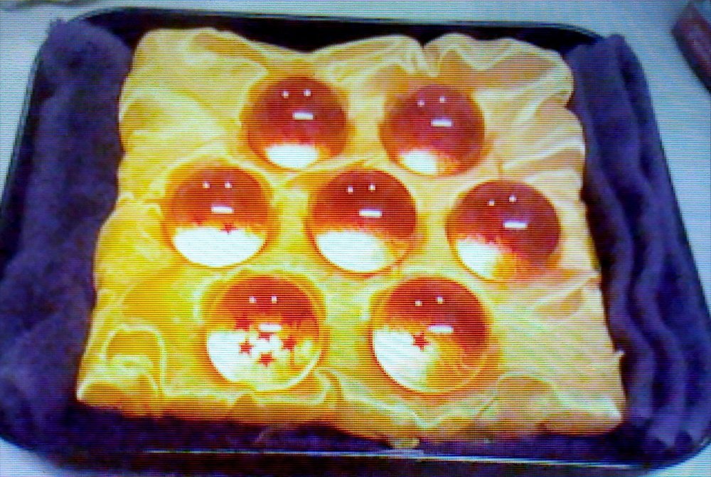
A nice feature of this game is that you can import the images taken on your Nintendo 3DS to your Quick Draw canvas for easy reference — which is exactly what I did when I started.
To start, you can choose between three tool kits to compose your pieces in Quick Draw — paints, pastels, and pencils. I chose paints for this one. With the paint tool set interface, I mixed together a rich purple and flooded the canvas for the background with my largest brush for quick coverage.
One of the things that our wise virtual instructor Vince says in Art Academy is to paint from background to foreground, and not to worry too much about the details at first — and he’s right, especially when you’re working with paints in real life. Once I was happy with the colour and the folds I had made with a darker purple, I “dried” my painting.

I knew I had to block out the yellow satin fabric underneath the Dragonballs, so with the second largest brush in my tool kit and the yellow gold I mixed together, I blocked out the fabric, giving it some uneven edges to show that the fabric was gathered in some places.
Because the painting was dried, if I made any mistakes with the edges, I could take my virtual wet cloth and wipe off any paint without messing up the background. Think of it like a paint eraser (although it wouldn’t work as effectively in actual painting, as paint dries as you work on it, not just when you want it to. But hey, video games, screw logic!)
I don’t have a picture of it as I was sort of caught up in painting at one point, but I drew out the outlines of the Dragonballs with my smallest fine-tipped brush, mixing together a muddy, watered down orange while using the grid as a guide. The grid helps with proportion and positioning, although it is good practice to try not using it. For the purpose of this article, I’m letting you know that there is a grid to help you out if you need a hand, and there’s no shame in wielding it.
Now the fun part: fabric creases. Personally, I like to work building up shadows and midtones, while focusing on highlights last, and I mixed varying shades of darker gold and lighter yellow to achieve this. Fabric is discussed in Art Academy (albeit briefly) but an important pointer is to pay attention how light hits fabric, as this helps indicate how the folds should turn out in your art. Once I was happy with how everything was blocked out, I blurred the tones together, while keeping the obvious highlighting for the shine on the fabric.
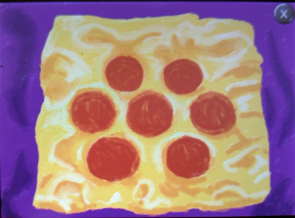
Alright, now the Dragonballs. Using the colour matcher in the paint tool kit, I mixed together a dark reddish orange to create the base for the Dragonballs. Seeing as how it dominates the colour of the ball, it only made sense to do that then build from there. Although hilariously enough, once I finished painting in the Dragonballs, the picture resembled a very square piece of cheese and pepperoni pizza. (I digress for a moment to bring you this wonderful 2-second public service announcement.)

The balls reflect light in an interesting way, if you noticed in the reference photo. After shading underneath them, I used variants of yellow-orange, white, and red to create the glow within the balls from how the light source was hitting them. Blending the colours into a lovely gradient, there was only one small matter to deal with in order to really make the Dragonballs have that wonderful reflective feel: backlighting.
It’s a tiny detail but when added, it really solidifies the glowing quality of the Dragonballs. All I had to do for this was take a lighter orange and outline the tops, which you’ll see in the screenshots below.
I finished off with any additional touch ups to the satin folds and added in white highlights on the surfaces, as well as the stars in each ball. Overall, the whole thing took me about an hour.
Art Academy: Lessons for Everyone! was a very interesting “game” concept, but I enjoyed going through all of the lessons and playing around with the tool sets. The tools themselves are realistic enough that it works for a video game platform, and I appreciated that each lesson and art piece I worked on actually made me work with my happy accidents, instead of being handheld if I made a mistake.
For those starting to get into drawing, the explanation of the tools in each set provides a lot of value should beginners wish to purchase such tools for themselves in the future. The tutorials were lengthy, not overbearingly so, but just enough to get the gist of what you’re trying to accomplish. And even if you are one of those impatient gamers, there are options to allow you to skip past dialogue (although some of the information can be pretty valueable.)
This game is great for beginners who are wanting to learn and acquire skills to dive into drawing, painting, and everything else art has to offer. As for those who’ve been doing this drawing gig for a while, a lot of it might seem like things you know already, but it’s good for practice and warm up. And sometimes, it’s nice getting back to the foundation of traditional exercises. It’s even good if you want to jot down a quick idea and don’t have a pencil or paper around… but somehow you have your 3DS and your trusty copy of Art Academy: Lessons for Everyone! just happens to be in the cartridge slot.
I will admit, the gallery does bother me a little bit: You are only allowed to hang up 10 pieces of your work, and yet, when given the option to view your gallery, the game makes a point of taking you through two large rooms which don’t allow you to hang up artwork in there for some reason. I mean, it’s not a detrimental thing, but I thought it was sort of like one of those customizable rooms you get, and I kind of wanted to pimp that out a bit. You know, get some people in there for a viewing in-game.
Which would be kind of a cool concept, and would make for an excellent mini-story and game, too. Get on that, Headstrong Games (or hire me, whatever works for you).
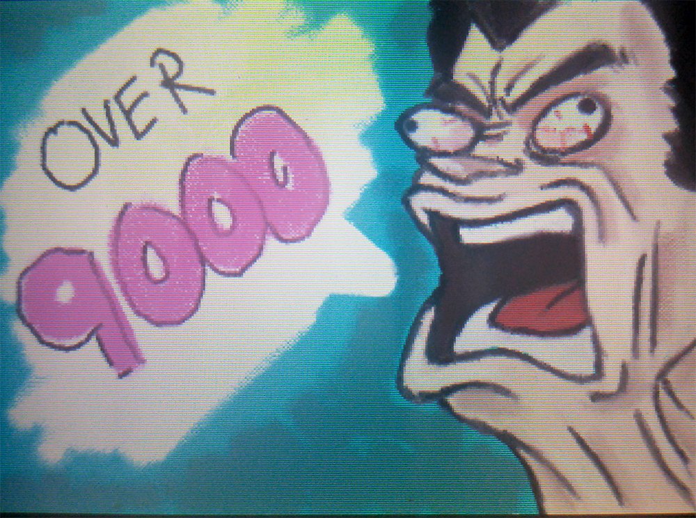
To end off, here’s a bonus drawing for you. Just keeping with the theme, you know.
Want to read the first two parts of the Art Academy series? Check them out here: Part 1 and Part 2.
Kate is a contributor and a Graphic Designer for AYBOnline, and producer on the Level 1 Scrubs podcast. She hopes that Vegeta picture she drew makes you laugh. Her opinions are her own. Feel free to follow on Twitter and her Facebook page, where she updates about her creative projects!


